On This Page
Customizing the Default User Interface
Use the information in this section to customize the Default UI so that it matches your
brand’s visual identity. The included screenshots highlight several style elements with labels
for reference. Note that not all available style elements are shown. A detailed description of
the style elements follows the screenshots.
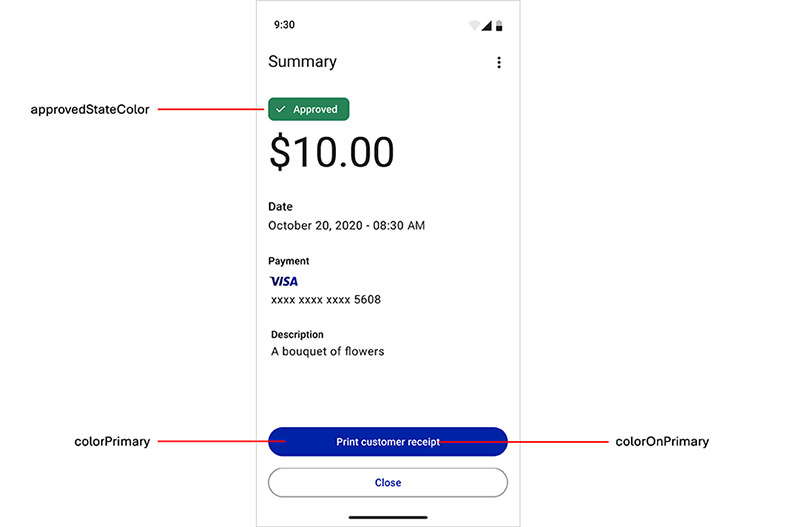
Figure:
PAX All-in-One Default UI Style Elements
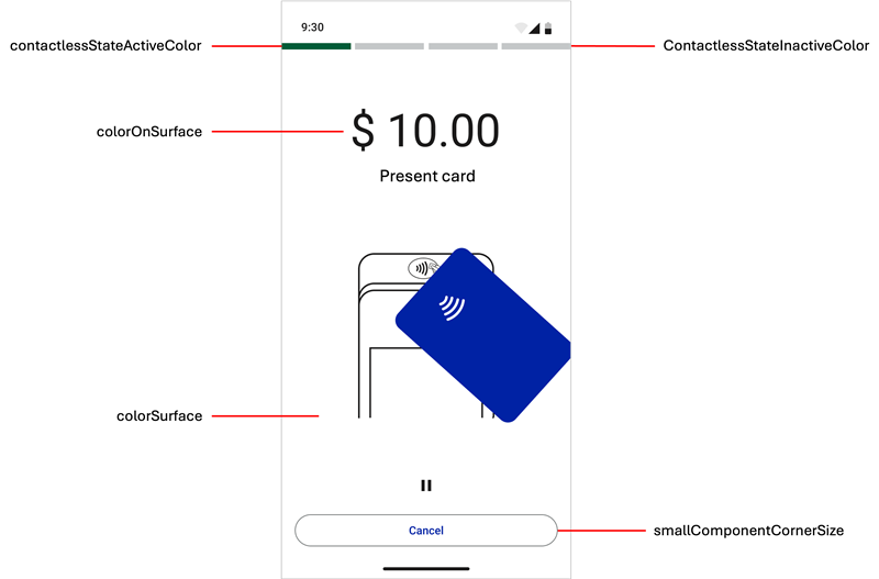
Figure:
PAX All-in-One Default UI Style Elements
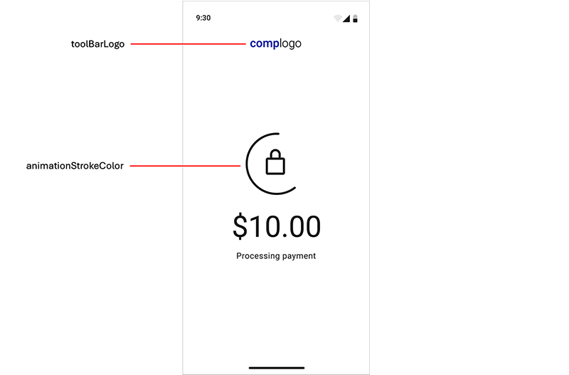
Figure:
PAX All-in-One Default UI Style Elements
- animationStrokeColor
- Stroke or outline color for animations.
- approvedStateColor
- Indicator color that appears for the approved transaction badge and animation.
- cardPresentAnimationStrokeColor
- Overrides theanimationStrokeColorstyle element in the card reader drawing on present-card animations. By default, this element is the same color as theanimationStrokeColorstyle element.
- colorControlActivated
- Color applied to switch controls in their active state.
- colorOnPrimary
- Primary color that appears for the filled button text and animation details.
- colorOnSurface
- Color for text that appears over the content view, transaction status badges text, and outlined button stroke.
- colorPrimary
- Primary color that appears for the filled buttons and animations.
- colorSurface
- Background color that appears for the content view.
- colorSurfaceOnSurface
- Background color for displayed lists such as transaction history.
- contactlessStateActiveColor
- Active indicator color that appears when the contactless interface is ready or when a payment card is tapped on the device.
- contactlessStateErrorColor
- Error indicator color that appears when a problem occurs when the device attempts to read a card on the contactless interface.
- contactlessStateInactiveColor
- Inactive indicator color that appears when the contactless interface is not active.
- declinedErrorStateColor
- Indicator color that appears for these elements:
- Declined transaction badges and animation
- Error transaction badges and animation
- Error dialog boxes
- Input field error messages
- notificationColor
- Alert notification color that appears withPoor connectionandLow batterynotifications. The default color is yellow.
- preAuthorizedStateColor
- Indicator color that appears for the pre-authorized transaction badge.
- smallComponentCornerSize
- Defines the corner radius of the buttons and transaction status badge. Set this element to0dpfor square corners,4dpfor slightly square corners (default), or32dpfor round corners.
- toolBarLogo
- Logo that appears during transaction processing. The image must be rectangular, have the minimum dimensions of 144 x 36 pixels, and a 4:1 ratio.
Customize Style Elements Using a Theme
Follow these steps to customize the Default UI style elements.
- Introduce a new theme to your application that includes theTheme.PayButton2theme as a parent theme:<!-- Paybutton theme --> <style name="Theme.AppTheme.SampleTheme" parent="Theme.PayButton2"> <!-- Text color --> <item name="colorOnSurface">@color/black</item> <!-- Background color --> <item name="colorSurface">@color/white</item> <!-- Contactless indicators --> <item name="contactlessStateActiveColor">@color/dui_green</item> <item name="contactlessStateInactiveColor">@color/dui_light_gray2</item> <item name="contactlessStateErrorColor">@color/dui_red</item> <!-- Transaction status --> <item name="approvedStateColor">@color/dui_green</item> <item name="declinedErrorStateColor">@color/dui_red</item> <!-- Also used for error messages and dialogs --> <item name="preAuthorizedStateColor">@color/dui_dark_gray</item> <!-- Filled buttons and animations primary color --> <item name="colorPrimary">@color/dui_blue</item> <!-- Used over the primary color for text on filled buttons and details on animations --> <item name="colorOnPrimary">@color/dui_white</item> <!-- Corner radius for the buttons and transaction status badges --> <item name="smallComponentCornerSize">4dp</item> <!-- Company logo --> <item name="toolBarLogo">@drawable/logo_140x36</item> <!-- Stroke color for icons and animations --> <item name="animationStrokeColor">@color/dui_black</item> <!-- Stroke color for terminal in present card animation. By default the same as animationStrokeColor --> <item name="cardPresentAnimationStrokeColor">@color/dui_black</item> </style>
- Call one of these methods to set the theme:mposUi.themeRes = R.style.Theme_AppTheme_SampleTheme
Customize Style Elements Using a UiConfiguration Instance
UiConfiguration
InstanceThis customization feature enables you to dynamically change some Default UI style elements
while the app is in use. These style elements can be customized using a
UiConfiguration
instance: - toolbarLogo
- colorScheme(and its sub-elements)
- cornerRadius
UiConfiguration
instance:- Create theUiConfigurationinstance.mposUi.configuration = UiConfiguration( // other UiConfiguration parameters toolbarLogo = "....", colorScheme = UiConfiguration.ColorScheme( colorPrimary = 0xFF1A1F71, colorOnPrimary = 0xFFFFFFFF, colorSurface = 0xFFFFFFFF, colorOnSurface = 0xFF1C1B1B, ), cornerRadius = UiConfiguration.CornerRadius.ROUND )
Enable Dark Mode in the Default User Interface
When the device is in dark mode, the Default UI payment flow screens appear in darker
contrasting colors than the colors used with the default screen settings (light mode). The
Dark Mode feature might be used in low-light settings such as restaurants and bars. For
more information about this setting, see the Android documentation.
The default dark mode background color is dark gray (#121212). To change the background
color to pure black (#000000), add a new
Theme.PayButton2
theme in the
value-night
folder.Follow this step to change dark mode behavior.
- If you want to enforce light or dark mode across your application and Default UI, regardless of the phone's dark mode setting, use this Android method. This example enforces night mode.AppCompatDelegate.setDefaultNightMode(AppCompatDelegate.MODE_NIGHT_YES)